LeapFrog.com's Educational Toys
;)
LeapFrog.com
is a well respected leader in web enabled educational toys.
The priorities: Create a warmer, more approacheable and professional looking, intuitive website appealing to children and their parents, that has a more environmental feel. Showcase the web enabled toys and demos, and support the established functionality. Be compatible with the established preexisting frog pond theme and navigational menu bars and pond background (tile).
We started with the 4 landing pages, and a suite of compatible subtitle graphics for sub content tiers.These were well received, and there are plans to segue the rest of the website toward this new look and feel, and some unpublished designs are pending complex functionality issues.
I designed the landing pages, including calling out text & link color and sizes, and created all the graphics in these examples. I was pleased to wield my illustration skills in a whimsical style, to imaginatively incorporate problematic uninspiring photos.I created soft outdoor themes to breathe a little fresh air into the website, and evoke the immersive environmental experience the client desired. Along with a lighthearted illustrative style, I added life to the page with animated ladybugs, dragon flies, and other little critters, triggered by java rollovers.
Note: there is no black type employed on these pages. Rich muted colors were used to soften and gently organize the content, and guide the visitor. Charcoal, plum brown, moss greens, teals and other passive meadow and pond colors filled the main content, while warmer corals and golds drew attention to important titles. The titles I created in a wavey water ripple feel, were very well received, and matching subtitles employed throughout the remaining sub content pages.
Executive Producer: Jim Schuyler
Art Director: Corie Hunt
![]()
;)
![]()
;)
![]()
;)
![]()
;)
;)
;)
;)
;)
;)


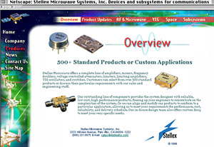 Stellex Website
;)
;)
;)
;)
;)
;)